页面布局
页面布局,说的浅显点,就是页面排版。如何利用已知的div,table,tr,article,section等html5元素,解决用哪些、怎么放、放多少的问题。
好的排版,在css样式文件,没有生效的情况下,也能理解界面整体轮廓。
不会因css生效后,元素位置大调整。否则,界面性能差且体验不友好。
布局方式
正常文档流 或者说,采用浏览器默认行为, 元素按照出现位置,进行排列。块元素,独占一行;行内元素,先后排列。
快级别元素,譬如div,默认只设置宽度,不设置高度的。
display
block, inline or inline-block 正常文档流中生效
grid ,flex 决定是子元素 (直接子元素) 如何布局的
flex 为何会出现呢?
当然是为了在一个方向上,布局更简单. display:flex ;
flex-direction 默认row
align-items 默认 stretch ,按照最高的元素拉伸
1
2
3
4
5
6
7
8
9
10
11
12
.wrapper {
display: flex;
}
.wrapper > div {
flex: 1;
}
<div class="wrapper">
<div class="box1">One</div>
<div class="box2">Two</div>
<div class="box3">Three</div>
</div>
grid为何要出现呢?
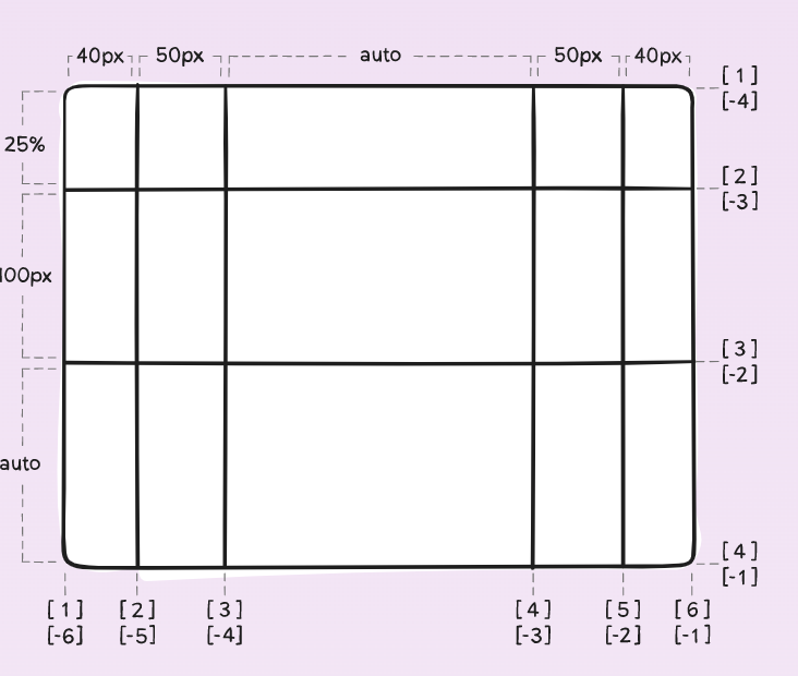
一个方向布局,怎么够呢?得两个方向呀。 display: grid
- grid-template-row 控制水平
- grid-template-column 控制垂直
- 父节点,设置完毕, 自动分配子元素到对应的位置;或者grid-row,grid-column设置子元素
1 | .container { |
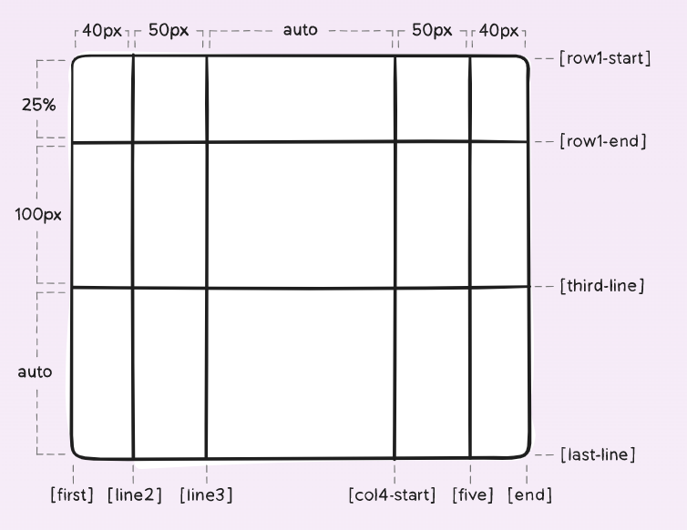
语法规则
直接定义row、column宽度
1 | .container { |
利用自定义名称+数值,设置布局
1 | .container { |
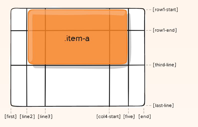
子元素布局
1
2
3
4
5
6.item-a {
grid-column-start: 2;
grid-column-end: five;
grid-row-start: row1-start;
grid-row-end: 3;
}
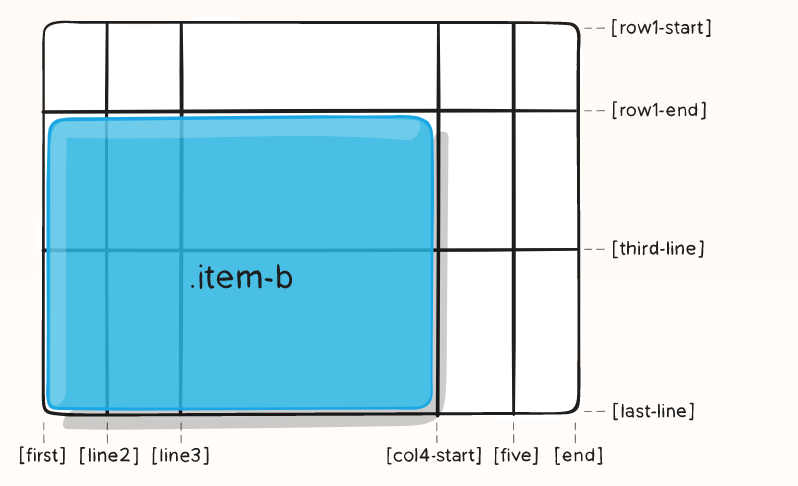
span 扩展
1
2
3
4
5
6.item-b {
grid-column-start: 1;
grid-column-end: span col4-start;
grid-row-start: 2;
grid-row-end: span 2; #默认span 1
}
其余简写语法
1 | #简写 |
float
元素浮动,左右摆放,脱离正常文档流
- left
- right
- none (不浮动,采用默认值)
- inherit(采用父容器规则)
position
精确的把元素控制在盒子模型中,盒子套盒子等,主要运用于界面局部布局,而非界面整体布局。
- static (不做任何改动)
- relative (相对于之前出现的位置进行x轴或者y轴移动)
- absolute (脱离文档流,相对于最近的非static定位的祖先节点)
- fixed (也脱离文档流,相对于浏览器定位)
- sticky (offset 类似fixed,没有则什么也不做,类似static)
table
固定的宽高布局,还能自适应,
- table ,th,tr,td元素标签布局
- css table
用来兼容不支持display: flex,grid,版本早的浏览器
1
2
3
4
5
6
7
8
9
10
11
12
13
14
15
16
17
18
19
20
21
22
23
24
25
26
27
28
29
30
31
32
33
34
35html {
font-family: sans-serif;
}
form {
display: table;
margin: 0 auto;
}
form div {
display: table-row;
}
form label, form input {
display: table-cell;
margin-bottom: 10px;
}
form label {
width: 200px;
padding-right: 5%;
text-align: right;
}
form input {
width: 300px;
}
form p {
display: table-caption;
caption-side: bottom;
width: 300px;
color: #999;
font-style: italic;
}
Multi-column 布局
按照column-width,column-count,从左到有,从上到下顺序,展示内容
1 | <div class="container"> |
元素默认样式
| 元素 | style |
|---|
参考
web-develop
赏
使用支付宝打赏
使用微信打赏
若你觉得我的文章对你有帮助,欢迎点击上方按钮对我打赏